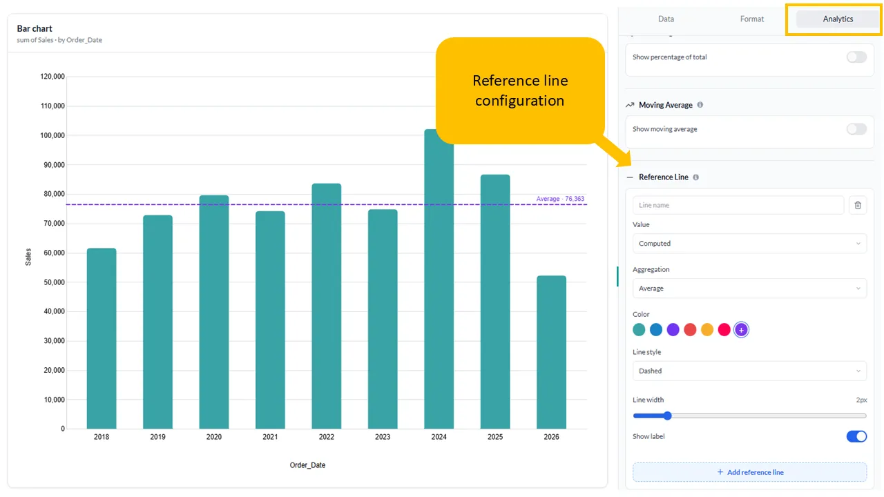
Reference Line
Reference lines allow you to visually highlight key benchmarks, targets, or statistical summaries directly on your data visualizations. You can easily add reference lines to Bar, Line, Area, and Combination charts to make your dashboards more informative and actionable.
How to Add a Reference Line
Section titled “How to Add a Reference Line”- Add a 1 categorical and 1 numerical value to your visualization.
- Open the Analytics tab.
- Expand the Reference Line.
- Click the Add reference line button at the bottom of the configuration card.
Configuration Options
Section titled “Configuration Options”Each reference line can be customized using the following settings:
- Name: Provide a custom label for the reference line (such as “Average” or “Target Threshold”). If the field is blank then the aggregation name is populated by default. You can hide the name by switching off the Show label toggle button.
- Value: Choose between a Constant value (a fixed, manual number) or a Computed value.
- Aggregation: When using computed values, choose from statistical aggregations including Average, Sum, Min, Max, or Median.
- Color: Select a preset color theme or use the color picker to distinguish your line.
- Line Style: Customize the visual pattern of the line, such as Dashed.
- Line Width: Use the slider to adjust the thickness of the line (e.g.,
2px). - Show Label: Toggle this switch to control whether the label appears alongside the line on the chart.